

Feature expansion
Apply established visual decisions to reporting, billing, and account management screens.
Bezel for Product & Engineering Teams
Bezel helps product and engineering teams reduce UI design drift with shared tokens, component previews, and design context for AI coding agents. Extend or refresh your application using the visual decisions your product already depends on.
Consistency across features
Hardcoded values, old specs, and copied components make small visual differences difficult to trace. The next developer or agent may repeat an outdated choice without knowing it.
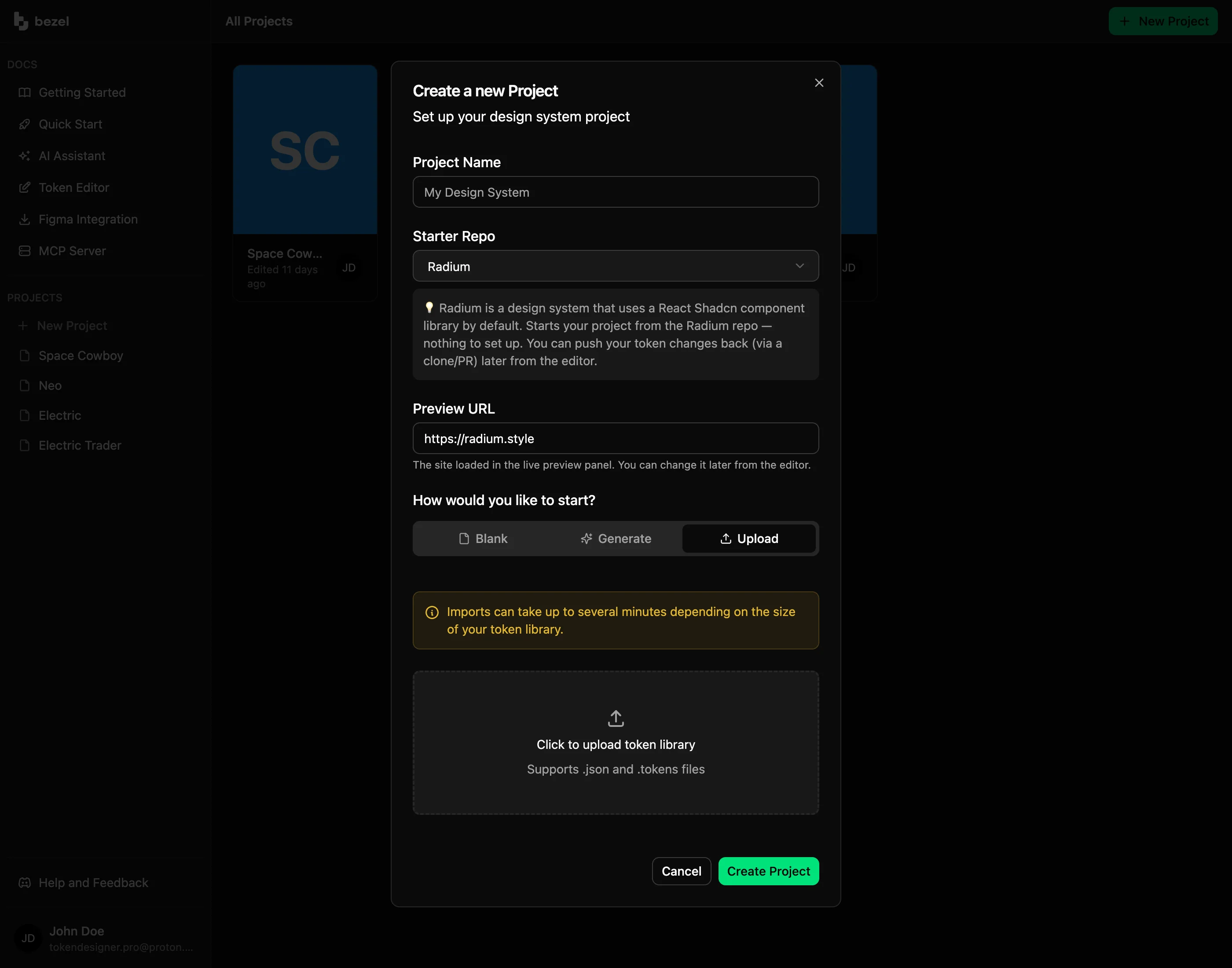
Use an existing design token file as a starting point in Bezel. Organize base values and semantic aliases so builders can find both the value and the purpose of a design decision.
AI-assisted implementation
An agent can write a plausible interface without understanding which colors, spacing, or typography belong to your product. That leaves engineering with a visual cleanup task.
Connect compatible tools through MCP so agents can retrieve project tokens and guidelines while implementing a feature. Review the resulting code and interface in your normal development workflow.
❯ claude› Which of our semantic colors change in dark mode? Use the Bezel MCP, don't guess.⏺ bezel - get-project-contexts (MCP) ⎿ {"projectName":"Bezel Marketing","contextGroups":[{"groupName":"theme","supportedValues":["$root","light","dark"],"defaultContext":"$root","description":"Context group \"theme\" with 3 values. The \"$root\" context is always the default/base value."}],"usage":"Pass a context value (e.g., \"$root\", \"dark\", \"light\") as the contextKey parameter when using query-tokens, get-token-by-path, export-tokens, or get-framework-overrides."}⏺ bezel - query-tokens (MCP)(groupPath: "semantic.color") ⎿ {"resultCount":14,"tokens":[{"path":"semantic.color.info.foreground","type":"color","contexts":{"$root":"{base.color.neutral.foreground}"},"exportNames":["info-foreground"],"extensions":{"com.bezel.app":{"exportName":["info-foreground"]}}},{"path":"semantic.color.info.default","type":"color","contexts":{"$root":"{base.color.info.500}"},"exportNames":["info"],"extensions":{"com.bezel.app":{"exportName":["info"]}}},{"path":"semantic.color.destructive.foreground" … +13 lines (ctrl+o to expand)⏺ Theme contexts are $root, light and dark. Of the 14 semantic colors, four carry a dark override: semantic.color.secondary.default (base.color.secondary.500 → .600), semantic.color.secondary.secondary-foreground (base.color.neutral.foreground → .background), semantic.color.tertiary.default (base.color.tertiary.500 → .600) and semantic.color.tertiary.tertiary-foreground (same swap). primary, destructive, info, success and warning keep their $root value in every theme.
A controlled visual refresh
Refreshing a product requires more than choosing a new primary color. A shared value may affect buttons, inputs, cards, and other states across the interface.
Connect your component library or app preview with Crystal and evaluate token edits in context. Publish a versioned snapshot when the decisions are ready for your team to implement.
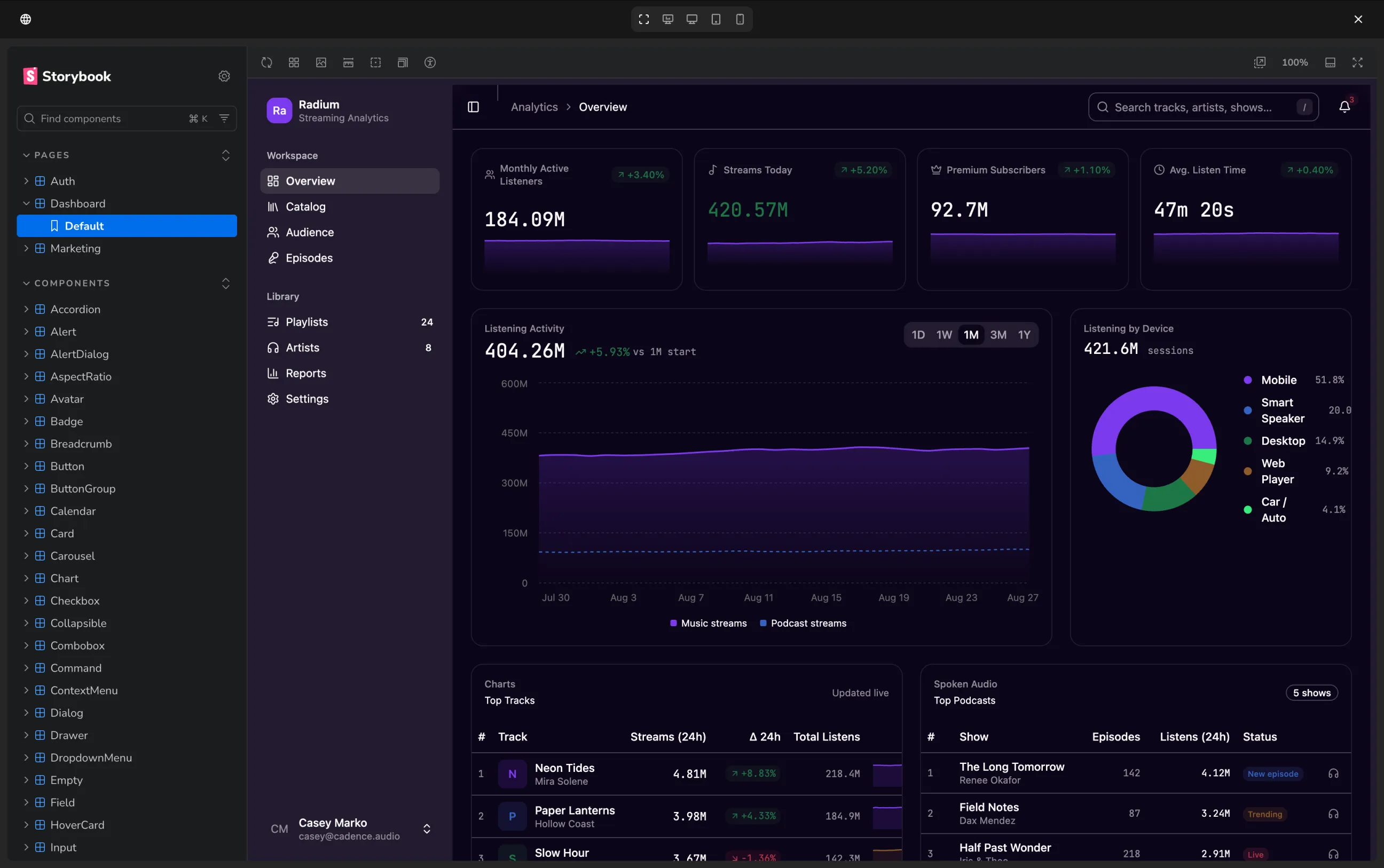
Apply established visual decisions to reporting, billing, and account management screens.
Refine an existing palette, typography scale, or shape language against connected components.
Replace scattered interface values with meaningful tokens during normal implementation work.
Use the parts of Bezel that fit your workflow, from a visual starting point to implementation-ready design context.
FAQ
Same System
Bezel helps solo founders create an AI-ready design system for a SaaS app and its marketing site.
Bezel for Solo Founders & Indie BuildersBezel helps startups turn early design decisions into a reusable system for their SaaS product and website.
Bezel for Startups & Small TeamsCreate your own colors, typography, and spacing in Bezel.
Bezel for Custom App DesignBezel gives design system teams a workflow for managing semantic tokens, previewing component changes, and publishing reusable design decisions.
Bezel for Design System TeamsBezel helps marketing and brand teams create a reusable design foundation for websites, campaign pages, and email templates.
Bezel for Marketing & Brand TeamsCreate shared design tokens, preview them on real components, and give your AI agents a consistent foundation for dashboards, admin panels, and business apps..
Bezel for Internal Tools & DashboardsBezel renders your own site beside the editor and restyles it as you change tokens.
Bezel for Share Design ChangesZero Drift Design
Create your design foundation in Bezel, or book a demo to explore how it fits the way you build.