Figma, both directions
Pull existing Figma variables in as a starting point, or publish your Bezel system out. Each theme becomes a Figma mode, so designers get the same structure developers do.
Describe your brand in a sentence and Bezel builds the token set. Adjust any value later, previewing every change in real time on real components. Ship it to your AI tools over MCP, to Figma, or as design-tokens.json.
Free to start · No credit card · Your first system in about a minute
What you actually get
design-tokens.json
W3C DTCG 2025.10, with OKLCH color
variables.css
Scoped CSS custom properties, one scope per theme
Figma variables
One Figma mode per theme, published from the plugin
MCP tools
17 tools your coding agent can call directly
v1.2.0
A semver release with a generated changelog
The gap
You can prompt a whole page into existence now. What you can’t prompt is the system underneath it, so every new screen drifts a little further off-brand than the last. Turning that pile of output into a component library anyone can reuse is the same slow, hand-fixed work it has always been.
The values are written down somewhere. The components have never read them.
Nobody checks a color pairing until someone files a bug against a live screen.
It looks clean and it hangs together. It just doesn’t look like you.
Change the brand blue and you’re hand-editing every component that hardcoded it.
The moment either side moves, the other is out of date and nobody notices for a sprint.
With no source of truth to read, it invents a new palette each time you ask.
How it works
01
Give Bezel a sentence about your brand. It picks a primary, builds the neutrals and accents around it, sets your status colors, chooses a typeface and a scale, then settles radius, border width and spacing. The ramps behind all of that come from real color math rather than a lucky guess.
02
Walk the guides or edit the tokens directly. Ask the assistant to warm up the neutrals or tighten the radius. Every change lands on real components in the preview as you make it.
03
Publish a semver release, push the variables into Figma, and hook your AI coding tools up over MCP. After that, generated code reaches for your tokens on its own.
Live preview
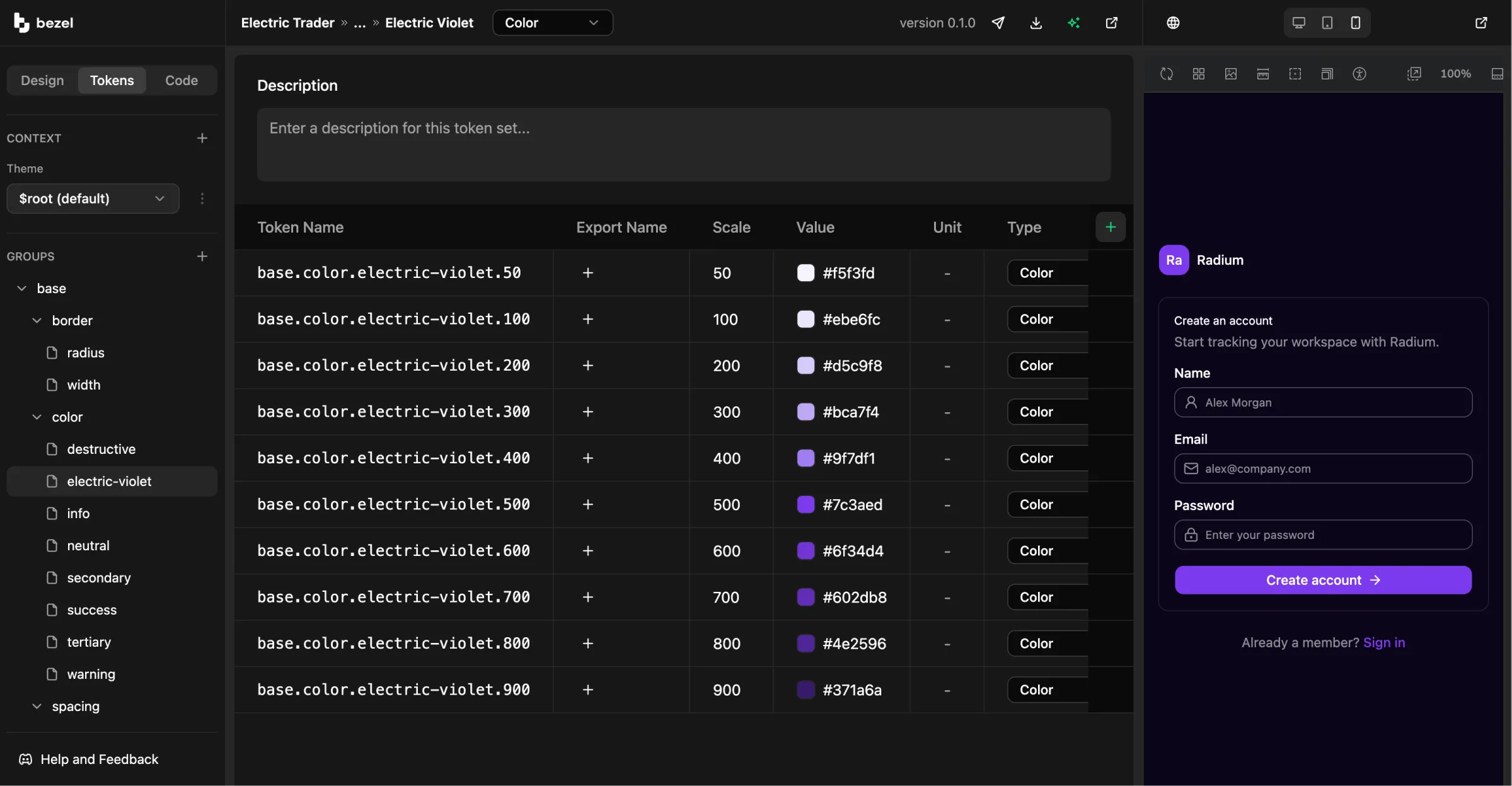
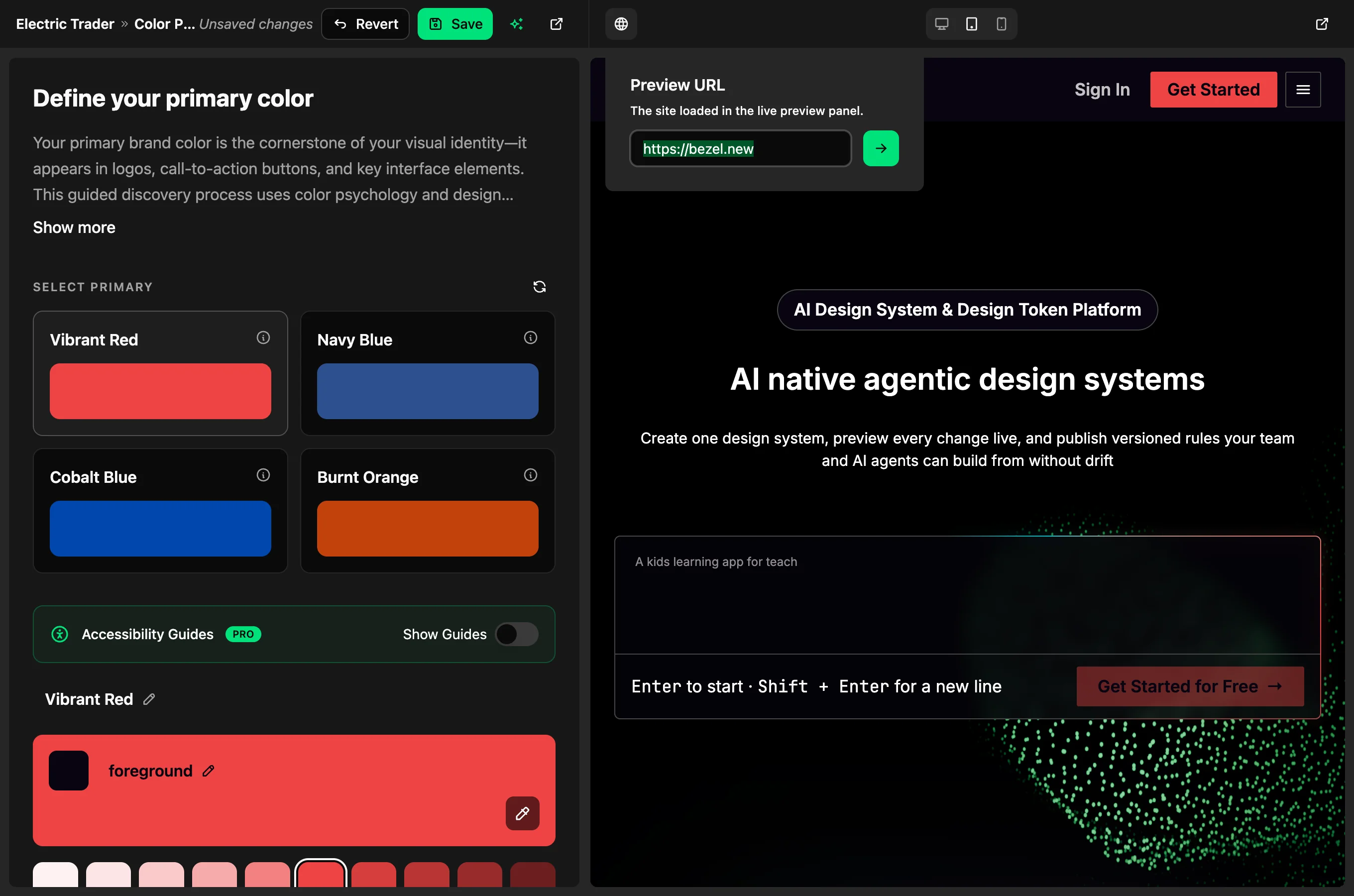
The right half of Bezel is a live browser pane. Edit a token and the change reaches it in under a quarter of a second, re-rendering components that are genuinely running. Nothing in there is a screenshot.
Out of the box the preview points at Radium, our open-source component library, which is shadcn/ui built on Base UI and Tailwind v4. That URL is yours to change. Add the open-source @bezel-labs/crystal receiver to your own Storybook or to a running app, point Bezel at it, and you’re previewing your tokens on your own components in your own framework. The preview matches what ships, because it is your own code running.
Guided setup
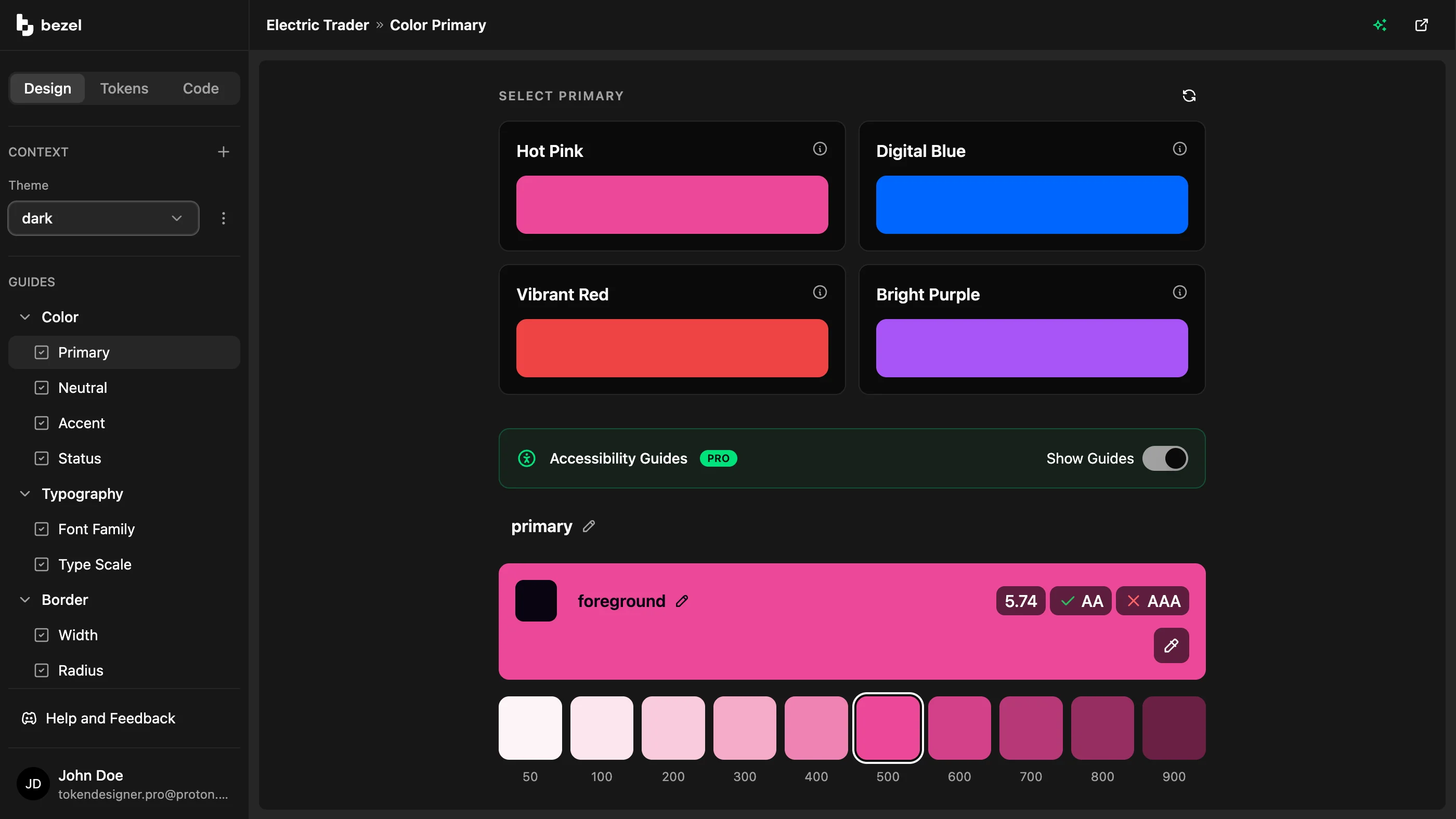
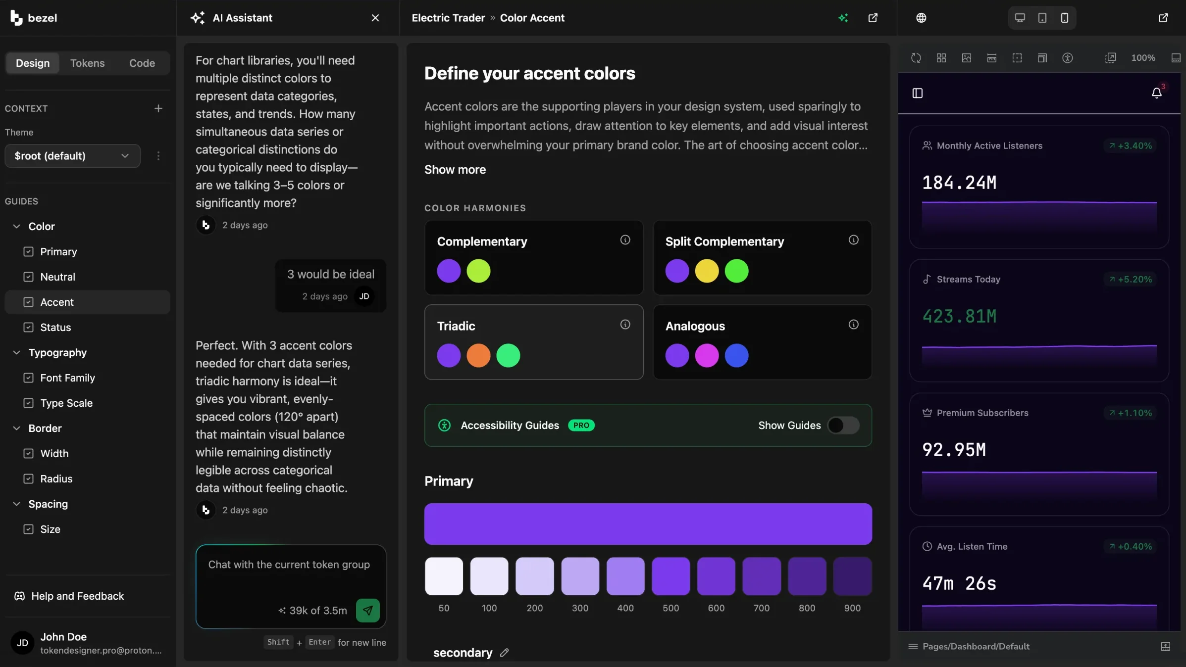
They cover primary, neutrals, accents and status colors, then font family and type scale, then border radius and width, then spacing. Each guide puts a few options in front of you, says why it picked them, and builds the full ramp behind whichever one you take.
Seed the border, radius and spacing guides from Tailwind CSS v4, shadcn/ui, Material UI v7 or Ant Design v5 if you’d rather not start from zero.
AI assistant
Every guide has an assistant sitting beside it, prompted to answer the way a professional UX designer would. Ask for what you want in ordinary language and you get back a recommendation along with the thinking behind it. The options turn up in the suggestions panel ready to click, so there’s nothing to copy out and apply by hand.
Token editor
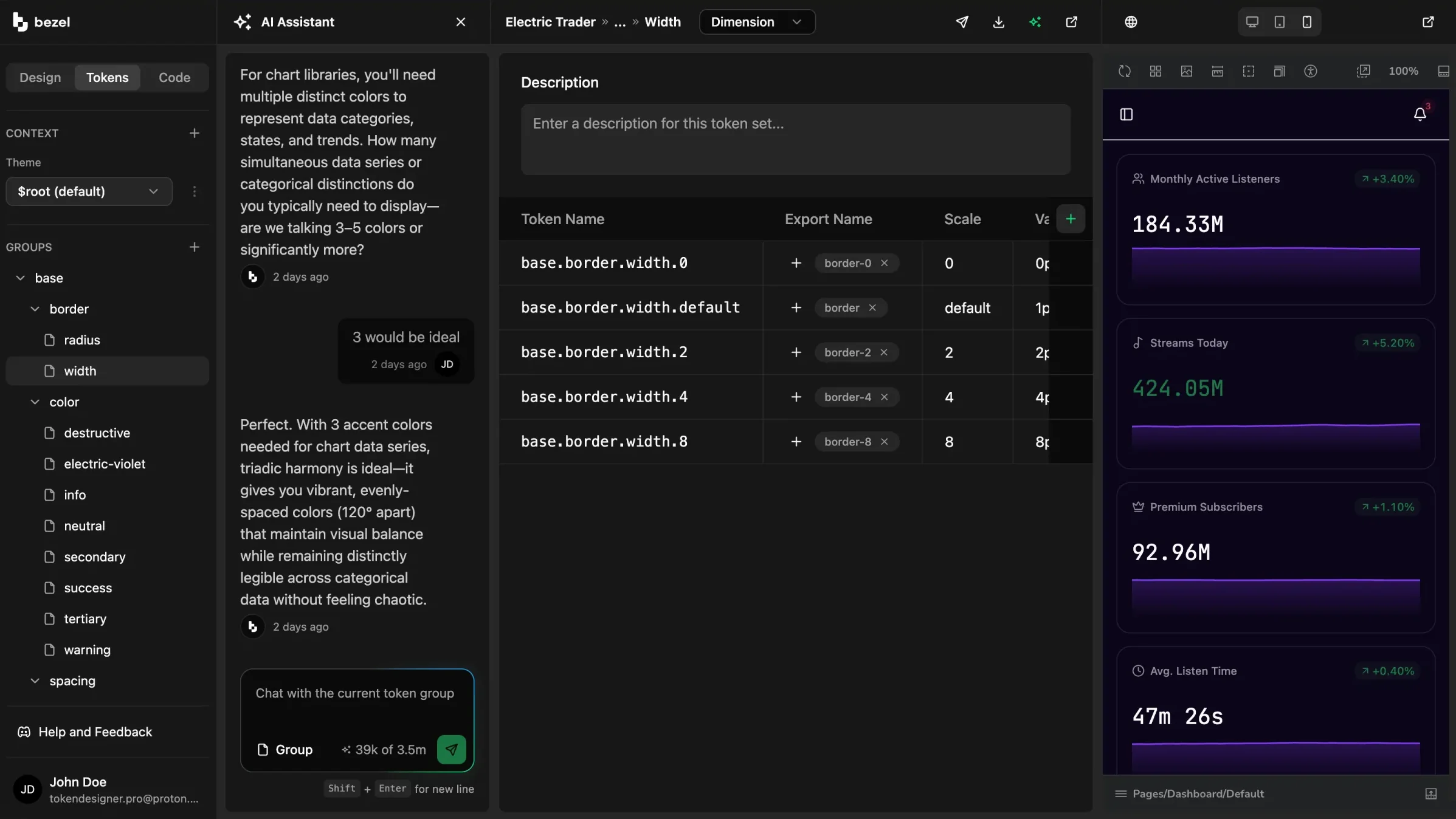
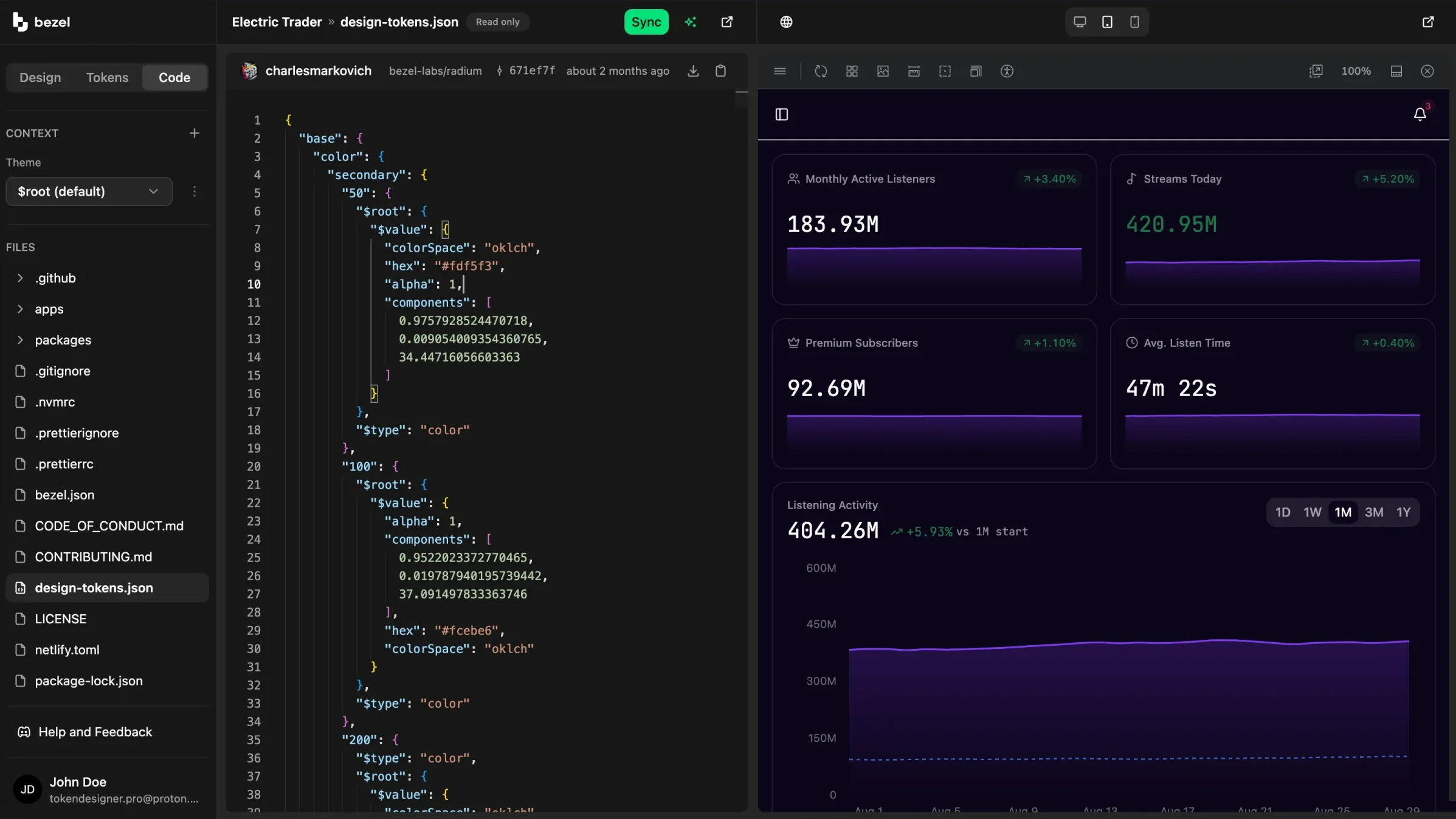
Underneath the guides sits a plain table. Base and semantic groups, export names, units, types and descriptions are all editable there, and all stored as W3C DTCG 2025.10 with OKLCH color. Because export names are kept separate from token paths, base.border.width.default can ship as border-1 and land wherever your framework expects to find it.
Add a context and override only what changes; everything else inherits from the default. Each context becomes its own CSS scope on export and its own variable mode in Figma.
Accessibility
ProEvery color pairing is scored against WCAG AA and AAA while you build. At save time Bezel picks the accessible foreground for you and prints the exact ratio on the token, so bad contrast gets caught in the system long before it reaches a QA ticket.
For AI coding tools
ProBezel runs a hosted MCP server. Connect it once and Claude Code, Cursor, Copilot, Windsurf, Zed, Cline or Continue can read your actual tokens while they write code. No more #3B82F6 turning up in a codebase where your blue is something else entirely.
17 tools, shaped so an agent doesn’t burn its context window reading them. Ask for the project manifest and you get the structure without any values. Query a few tokens by path. Or pull a whole bundle for a button, a card, an input, an auth page or a dashboard shell. There are deterministic utilities in there too, covering color conversion, ramp generation, contrast checks and unit conversion, alongside framework overrides that emit the right shape for Tailwind v3 and v4, shadcn/ui and Mantine v7.
.mcp.json
{
"mcpServers": {
"bezel": {
"url": "https://mcp.bezel.new/mcp",
"headers": { "Authorization": "Bearer <your-token>" }
}
}
}Everywhere else
Pull existing Figma variables in as a starting point, or publish your Bezel system out. Each theme becomes a Figma mode, so designers get the same structure developers do.
Connect any public GitHub repo that has a design-tokens.json at its root, then read the real source alongside your tokens, file tree and latest commit and all. Start from the Radium starter or bring your own.
Publish a semver release and Bezel writes the changelog for you, listing what was added, updated, deleted or renamed with the old and new values beside each entry. The token JSON for any past version is there to download or copy.
Who it is for
Get a coherent brand system in an afternoon instead of borrowing someone else’s default theme and hoping it reads as yours.
Pull the system into your editor over MCP so generated UI stays on-brand and you stop hand-fixing drift after every prompt.
Keep design and code pointed at the same tokens, and change the brand in one place when it moves.
FAQ
W3C Design Tokens Community Group format, schema version 2025.10, with color stored in OKLCH. Your project exports as a single design-tokens.json file.
Download or copy design-tokens.json into your repo root and run bezel build, the CLI from the open-source @bezel-labs/bezel-kit package. It emits a scoped variables.css plus contexts.ts and fonts.ts modules.
Yes. Every project has its own preview URL and you can change it at any time. Add the open-source @bezel-labs/crystal receiver to your Storybook or running app, point Bezel at that URL, and your token edits render on your components in your framework. If you’d rather not wire up your own, the default is Radium, an open-source shadcn/ui library.
Claude Code, Cursor, GitHub Copilot, Windsurf, Zed, Cline and Continue. Any MCP-aware client can connect. The MCP server is available on the Pro plan and above.
No. The GitHub connection is read-only. Bezel browses your repo so you can see your real source next to your tokens, but it never commits, opens pull requests or pushes changes. You move tokens into your codebase by downloading or copying the JSON.
Yes. Each token carries its own export name independent of its path, so tokens land under the names your framework expects. The MCP server can also emit framework-specific overrides for Tailwind v3 and v4, shadcn/ui and Mantine v7.
Yes. Import an existing token JSON file and Bezel normalizes it to the DTCG format, or pull your local Figma variables in through the Bezel Figma plugin.
Not yet. Projects are single-user today. Shared workspaces, roles and permissions are on the roadmap but are not available on any plan.
Get started
Bezel builds your token set from a single sentence about your brand. Or start from an empty project and tune every value by hand. Free either way.
Or join us on Discord and see what people are building