

SaaS MVP
Build onboarding, dashboards, and account screens around a reusable visual foundation.
Bezel for Solo Founders & Indie Builders
Bezel helps solo founders create an AI-ready design system for a SaaS app and its marketing site. Define your colors, typography, and spacing once, then give compatible coding agents the tokens and guidelines to build from.
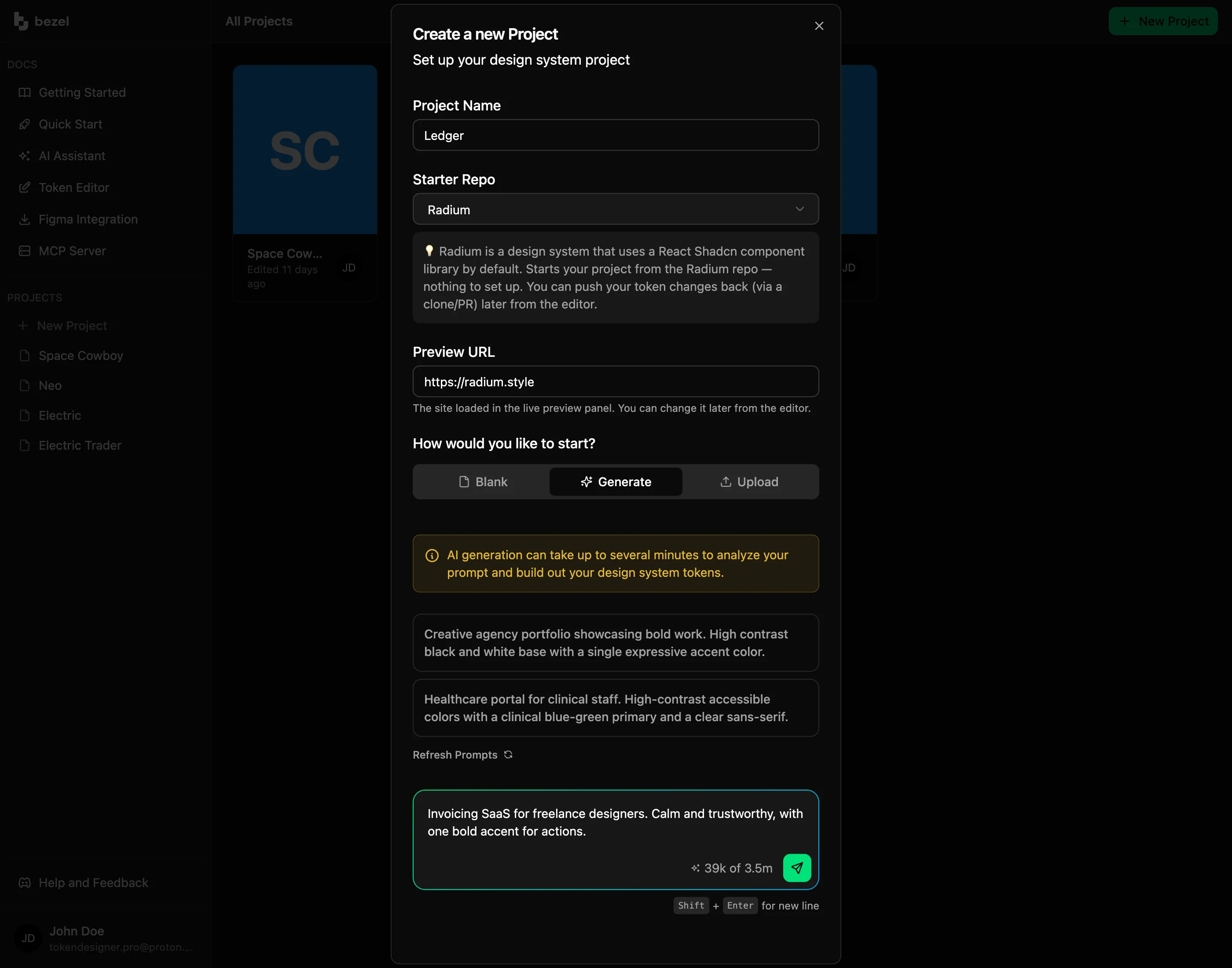
A foundation for your first launch
When you are the founder, designer, and developer, every font and color choice competes with building the product. One-off decisions quickly turn a working prototype into a collection of mismatched screens.
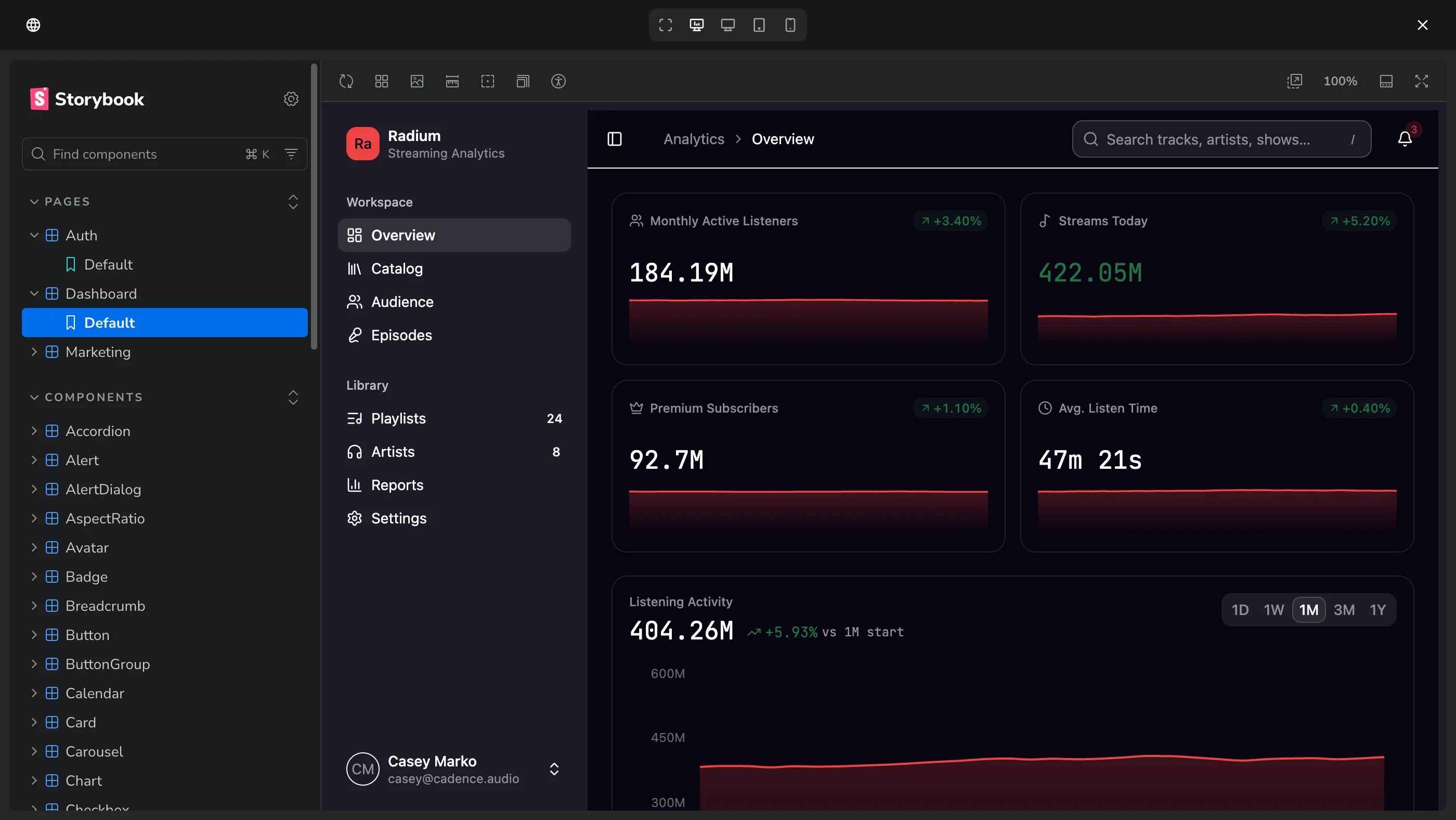
Describe your product and audience in Bezel. Use design guides and the AI design agent to refine colors, typography, spacing, and shape, then preview those choices on real components.
Vibe coding with context
Repeated prompts such as “make this match the rest of the app” leave an agent guessing about your design intent. A new screen needs the same rules as the last one.
Connect a compatible coding tool through Bezel MCP so it can retrieve your design tokens and guidelines. Use that context while the agent builds your signup flow, dashboard, or settings page.
❯ claude› Which of our tokens should the new dashboard stat card use? Ask the Bezel MCP for a recommendation and cite the token path for each value.⏺ bezel - get-project-manifest (MCP) ⎿ {"projectName":"Bezel Marketing","manifest":{"totalTokenCount":265,"topLevelGroups":["semantic","base"],"groups":{"semantic.color.info":{"path":"semantic.color.info","tokenCount":2,"tokenTypes":["color"],"hasContextOverrides":false,"children":[]},"semantic.color.destructive":{"path":"semantic.color.destructive","tokenCount":2,"tokenTypes":["color"],"hasContextOverrides":false,"children":[]},"semantic.color.success" … +44 lines (ctrl+o to expand)⏺ bezel - get-token-bundle (MCP)(intent: "dashboard-shell") ⎿ {"intent":"dashboard-shell","rationale":"Tokens for dashboard layouts: sidebar colors, accent colors, background/foreground, border, navigation typography, and spacing.","tokenCount":126,"tokens":[{"path":"base.color.neutral.600","type":"color","contexts":{"$root":{"hex":"#a0ada7","alpha":1,"colorSpace":"oklch","components":[0.7355971387930772,0.01688682189570729,166.45041141435854]},"dark":{"alpha":1,"components":[0.47835962278360683,0.00001857682703049302,0],"colorSpace":"oklch","hex":"#5d5d5d"}},"exportNames":["ring","sidebar-ring"] … +125 lines (ctrl+o to expand)⏺ bezel - get-token-by-path (MCP)(tokenPath: "semantic.color.primary.default") ⎿ {"path":"semantic.color.primary.default","type":"color","contexts":{"$root":{"original":"{base.color.vibrant-emerald.500}","resolved":{"hex":"#00e17b","components":[0.7977928911906637,0.20402581473743006,153.32127159192999],"alpha":1,"colorSpace":"oklch"},"aliasChain":["base.color.vibrant-emerald.500"]}},"exportNames":["primary"],"extensions":{"com.bezel.app":{"exportName":["primary"]}}}⏺ From the dashboard-shell bundle: surface --card and --card-foreground (base.color.neutral.background / base.color.neutral.foreground, both with a dark value), label --muted-foreground (base.color.neutral.400), border --border (base.color.neutral.700), corners --radius-lg (base.border.radius.lg, 10px), value size --text-2xl (base.typography.font-size.2xl, 35px), and --primary for the stat value (semantic.color.primary.default → base.color.vibrant-emerald.500, #00e17b). All existing project tokens, nothing invented.
From prototype to launch
Your launch page should feel connected to the product people sign up for. Recreating the palette and typography in another project introduces avoidable differences.
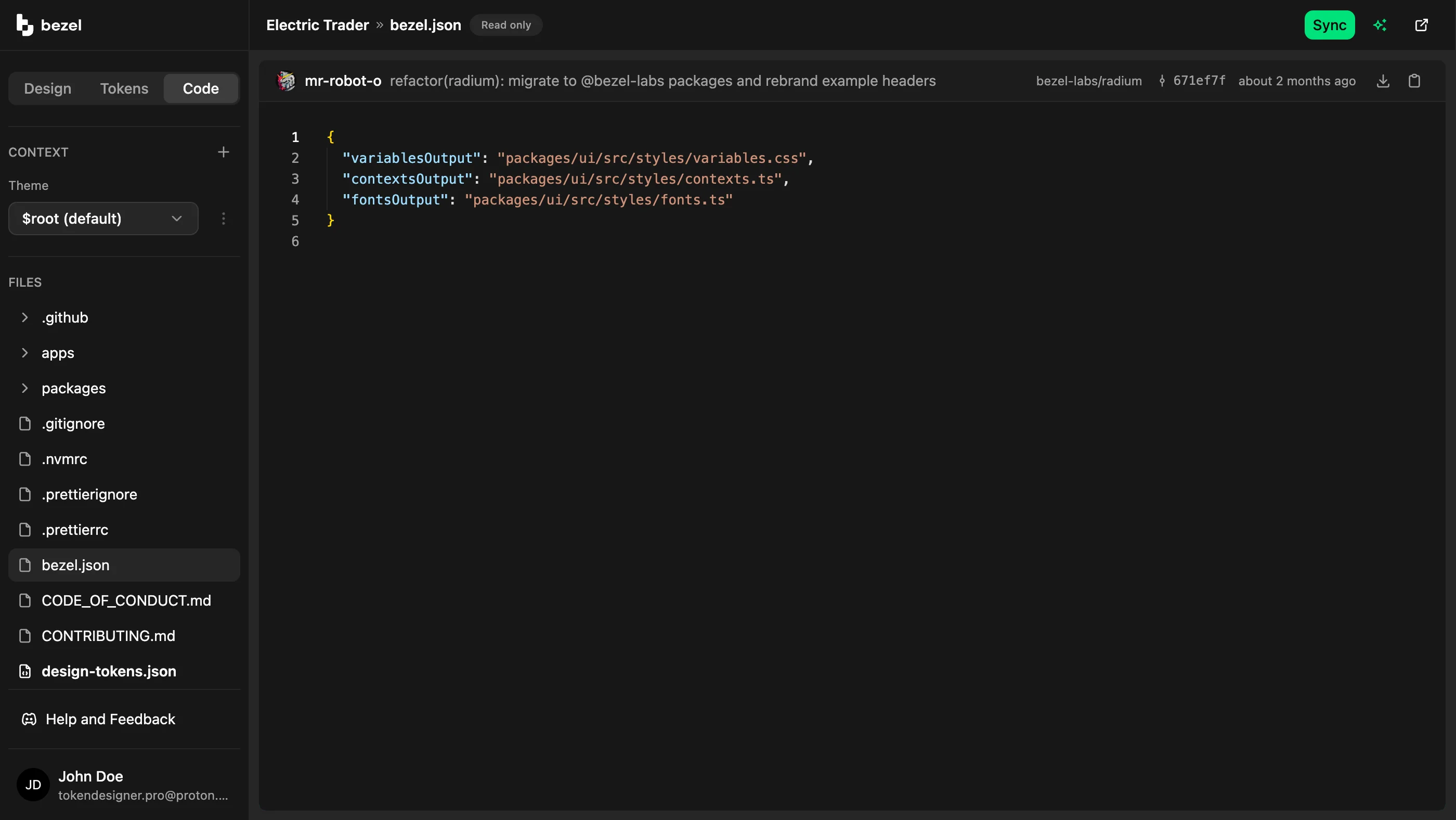
Export your design tokens and use Bezel Kit to generate CSS variables for your frontend. Bring the same foundation into your marketing site, with layouts and content suited to each surface.
Build onboarding, dashboards, and account screens around a reusable visual foundation.
Carry the product’s colors and typography into your homepage, pricing page, and signup journey.
Give an agent existing tokens and guidelines before asking it to extend the interface.
Use the parts of Bezel that fit your workflow, from a visual starting point to implementation-ready design context.
FAQ
Same System
Bezel helps startups turn early design decisions into a reusable system for their SaaS product and website.
Bezel for Startups & Small TeamsCreate your own colors, typography, and spacing in Bezel.
Bezel for Custom App DesignBezel helps product and engineering teams reduce UI design drift with shared tokens, component previews, and design context for AI coding agents.
Bezel for Product & Engineering TeamsBezel gives design system teams a workflow for managing semantic tokens, previewing component changes, and publishing reusable design decisions.
Bezel for Design System TeamsBezel helps marketing and brand teams create a reusable design foundation for websites, campaign pages, and email templates.
Bezel for Marketing & Brand TeamsCreate shared design tokens, preview them on real components, and give your AI agents a consistent foundation for dashboards, admin panels, and business apps..
Bezel for Internal Tools & DashboardsBezel renders your own site beside the editor and restyles it as you change tokens.
Bezel for Share Design ChangesZero Drift Design
Create your design foundation in Bezel, or book a demo to explore how it fits the way you build.