

Kill hardcoded values
Replace scattered hex codes, magic numbers, and one-off CSS values with tokens the whole team owns.
Bezel for Developers
AI can generate code quickly. The harder problem is keeping it aligned with the system it came from. Bezel gives developers and AI agents shared tokens, constraints, and design context to build from.
The direction we are building toward
Code generation solves the problem at a point in time. Design systems keep evolving: a token changes, typography shifts, a component improves. Every implementation disconnected from that source of truth can begin to drift.
Bezel’s direction is to let agents pull the latest system, identify relevant changes, update implementations, regenerate token and variable outputs, and prepare code changes for review. You review the PR. You shouldn’t have to rebuild the design system.
Define → Build → Connect → Change → Propagate → Validate. The connection between design and implementation shouldn’t disappear after code generation.
Design Token Export
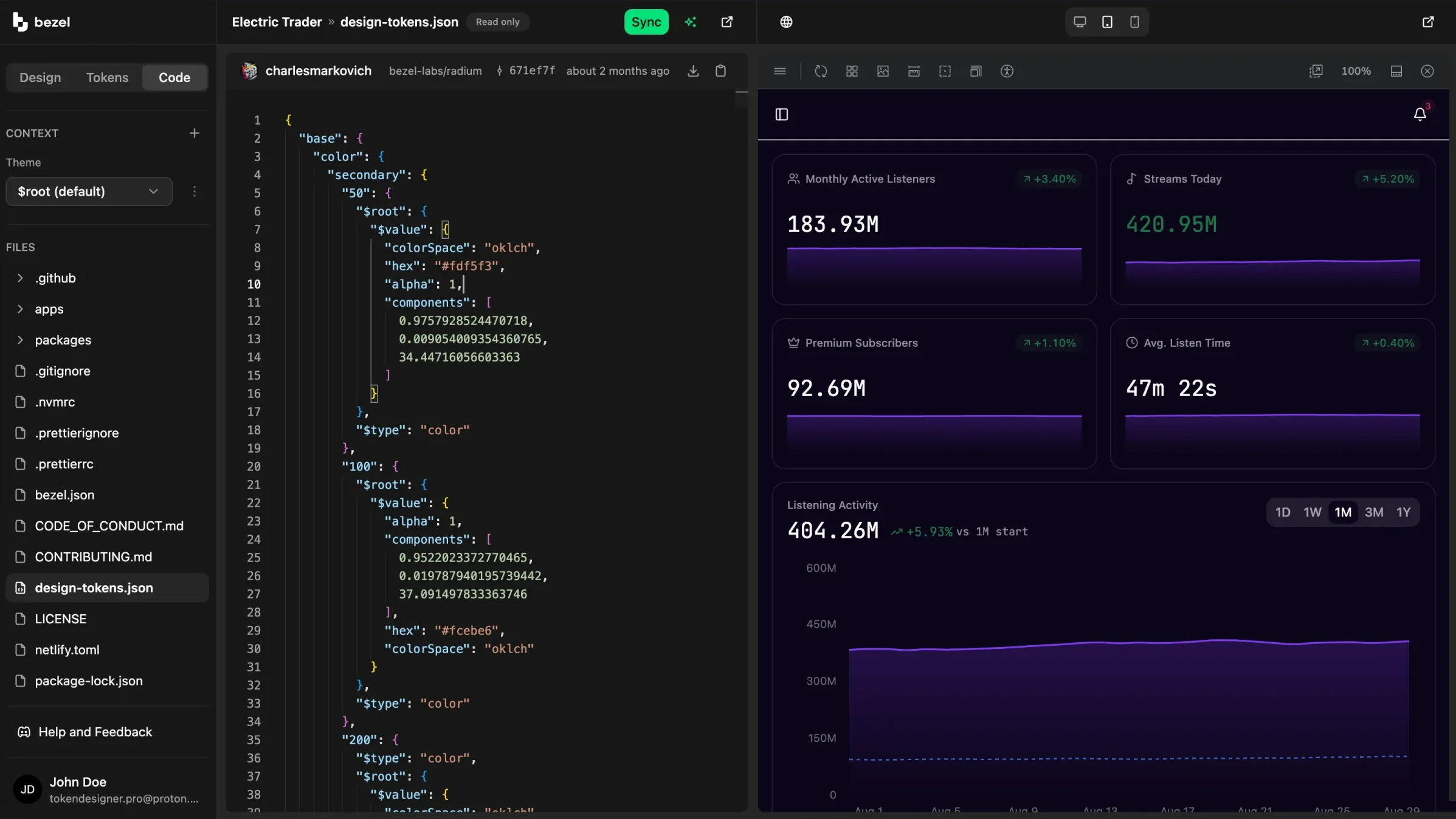
Export a W3C-format design-tokens.json and run Bezel Kit to generate scoped CSS variables. Export names are independent of token paths, so values can land under the names your framework expects.
Instead of hunting through design files for the real color, spacing, radius, or typography value, developers can build from a versioned token snapshot.
❯ npx bezel initbezel: wrote bezel.jsonbezel: bezel/variables.cssNext: 1. Add design-tokens.json to the project root — ask your AI agent for it via the Bezel MCP, or download it from your project. 2. Add "tokens": "bezel build" to your package.json scripts. 3. Run the build, then import bezel/variables.css in your entry file.❯ npx bezel buildbezel: wrote src/bezel/variables.css
Bezel MCP
Connect Claude Code, Cursor, or any MCP-aware tool to Bezel and generated UI can reach for your actual tokens instead of inventing a plausible theme in every prompt.
Agents can query the project manifest, pull tokens by path, or fetch a bundle for a component, layout, or interface pattern.
❯ claude› Style the submit button with our primary color. Use the Bezel MCP to look up the token, reference the CSS variables by name, and don't invent values.⏺ bezel - query-tokens (MCP)(search: "primary", contextKey: "$root", resolveAliases: true) ⎿ {"resultCount":2,"tokens":[{"path":"semantic.color.primary.foreground","type":"color","contexts":{"$root":{"colorSpace":"oklch","alpha":1,"hex":"#000000","components":[0,0,0]}},"exportNames":["primary-foreground"],"extensions":{"com.bezel.app":{"exportName":["primary-foreground"]}}},{"path":"semantic.color.primary.default","type":"color","contexts":{"$root":{"original":"{base.color.vibrant-emerald.500}","resolved":{"hex":"#00e17b","components":[0.7977928911906637,0.20402581473743006,153.32127159192999],"alpha":1,"colorSpace":"oklch"},"aliasChain":["base.color.vibrant-emerald.500"]}},"exportNames":["primary"],"extensions":{"com.bezel.app":{"exportName":["primary"]}}}]}⏺ bezel - contrast-check (MCP)(foreground: "#000000", background: "#00e17b") ⎿ {"input":{"foreground":"#000000","background":"#00e17b"},"contrastRatio":12.06,"ratioDisplay":"12.06:1","grade":"AAA","passes":{"normalText":true,"largeText":true,"wcagAA":true,"wcagAAA":true},"recommendations":["Excellent! This combination passes WCAG AAA, the highest accessibility standard."]}⏺ Update(src/routes/login.tsx) ⎿ Updated src/routes/login.tsx with 1 addition and 1 removal 41 - className="bg-emerald-500 text-black" 41 + className="bg-[var(--primary)] text-[var(--primary-foreground)]"⏺ --primary is semantic.color.primary.default → base.color.vibrant-emerald.500 (#00e17b) and --primary-foreground is semantic.color.primary.foreground (#000000). Black on #00e17b is 12.06:1, WCAG AAA. Both variables come from bezel/variables.css.
Live Previews
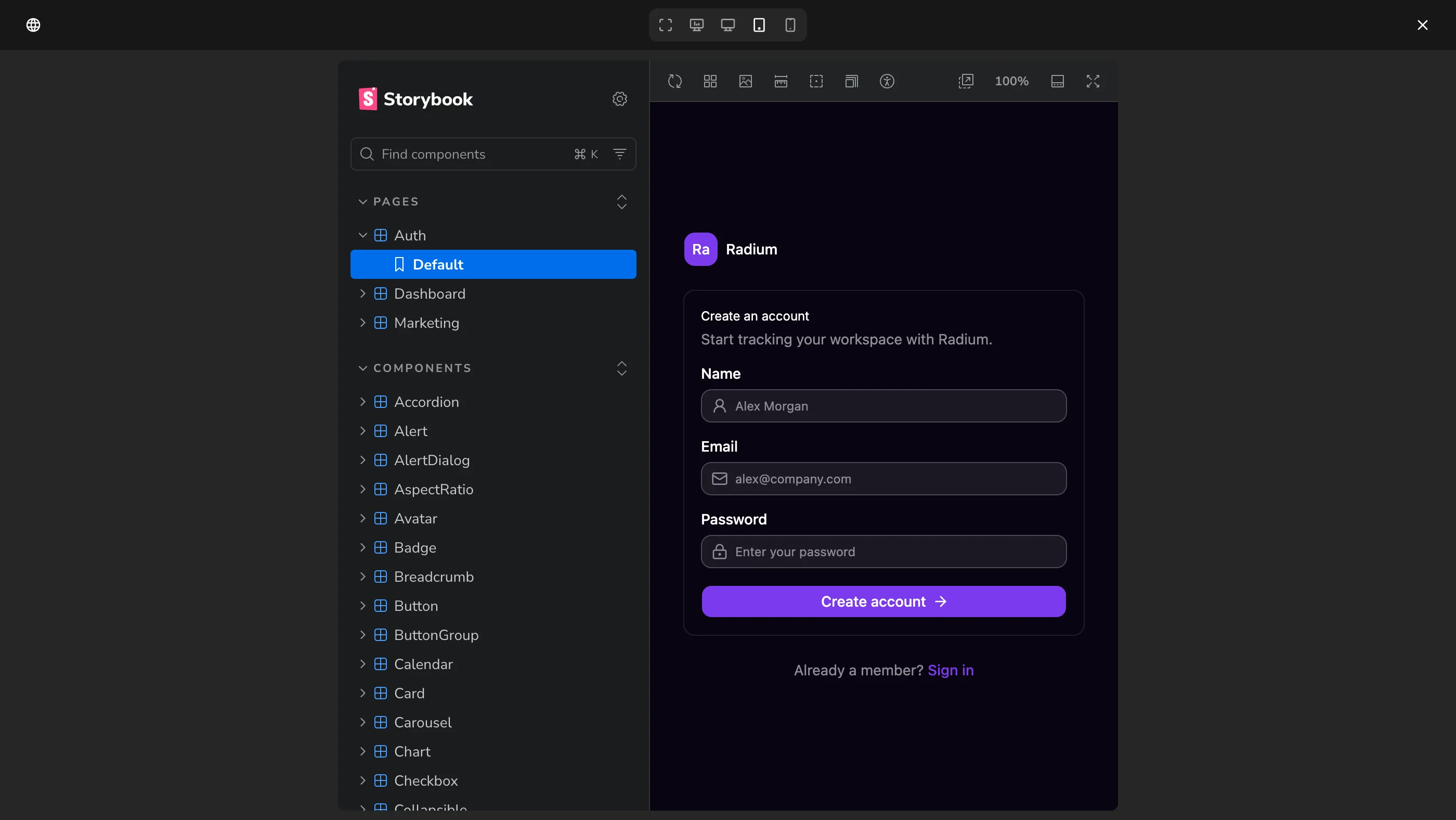
Point Bezel at your Storybook or a running app and token changes render on real components in your real framework.
Designers and design engineers can review the effect of a token change on production components before a developer has to open a pull request.
Replace scattered hex codes, magic numbers, and one-off CSS values with tokens the whole team owns.
Get exact token names, values, and relationships instead of reading implementation details from static specs.
Let coding agents pull the real design system so generated UI starts closer to production quality.
Bezel produces files, CSS output, and open-protocol context that fit normal frontend development workflows.
FAQ
Same System
Bezel gives product designers a guided place to define color, typography, spacing, radius, and accessibility decisions, then see those decisions applied to real components before developers or AI agents build from them..
Bezel for DesignersBezel gives design engineers a shared system for semantic tokens, component previews, exportable artifacts, and AI-readable guidelines, so design decisions keep their meaning from concept to production..
Bezel for Design EngineersAI agents can write interface code quickly, but they need explicit design context to stay on brand.
Bezel for AI-Assisted TeamsEarly access · Space is limited!
Join Bezel as an early product partner, export implementation-ready tokens, and connect AI coding tools to the same source. Join Pro at $7 per month for one year, billed annually, with personalized onboarding and support throughout your first year. As a product partner, your direct feedback will help guide new features and the future of Bezel.
Spots are extremely limited. Acceptance requires a demo and a commitment to sharing ongoing feedback.