

Create a new visual direction
Turn a product brief into design tokens, visual guidelines, and accessible palettes your team can review.
Bezel for Designers
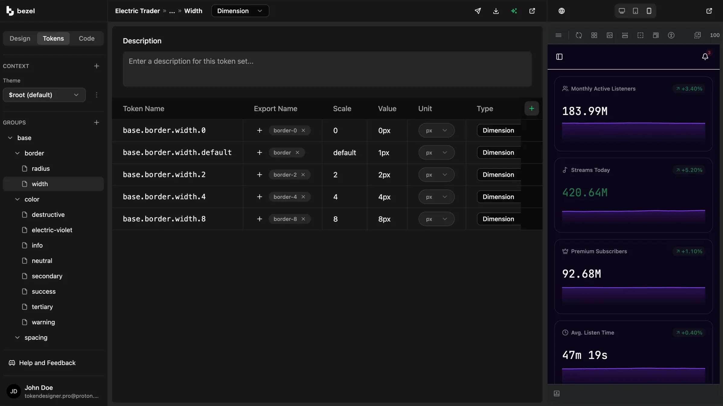
Bezel gives product designers a guided place to define color, typography, spacing, radius, and accessibility decisions, then see those decisions applied to real components before developers or AI agents build from them.
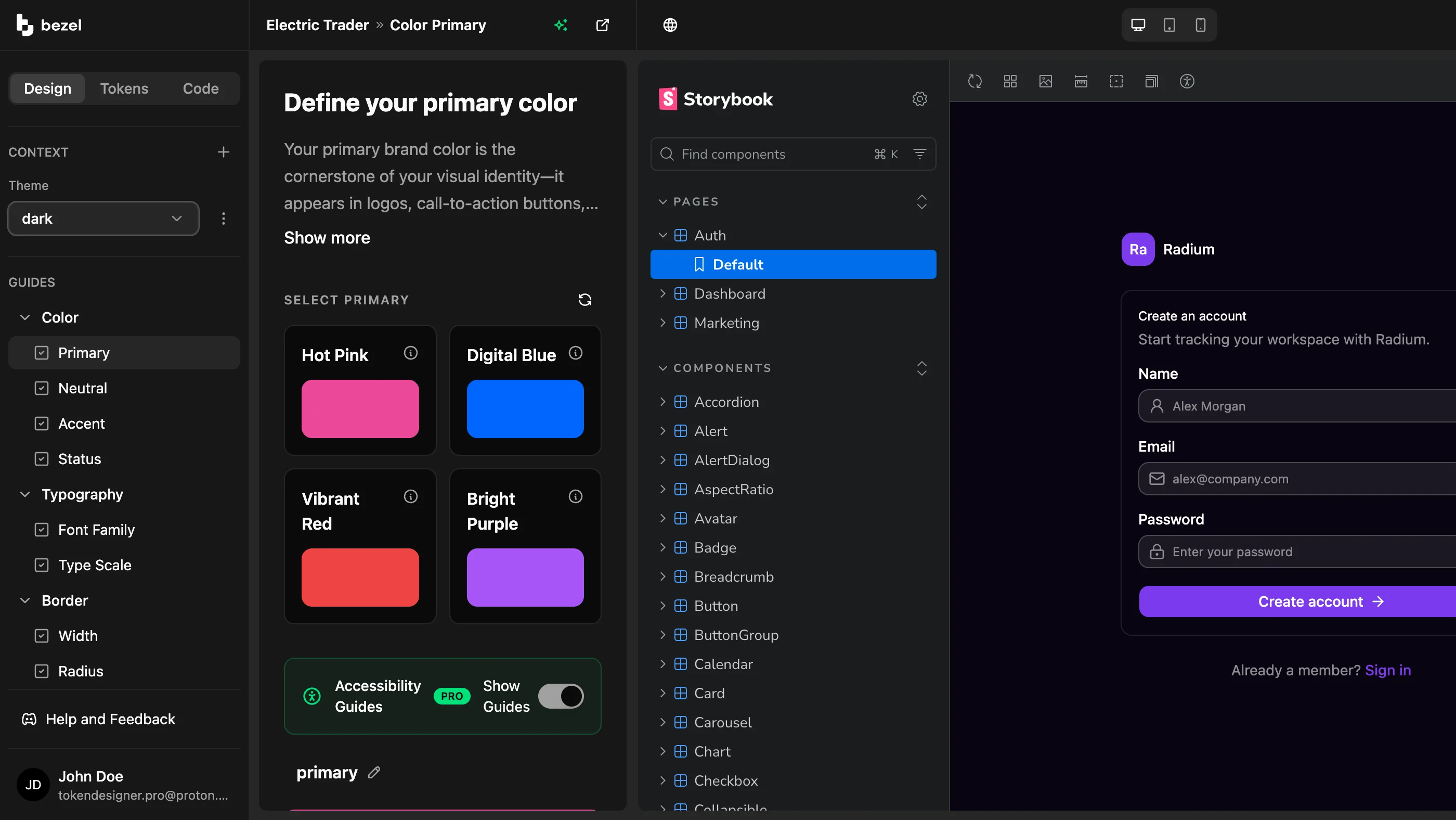
Design Guides
Describe the product, audience, and visual direction you want. Bezel turns that brief into practical recommendations for color, typography, spacing, and shape, with reasoning attached to each choice.
Use the AI guidance as a starting point, adjust every value yourself, or explore alternate directions. The result is not a moodboard. It is a working design token system your team can use.
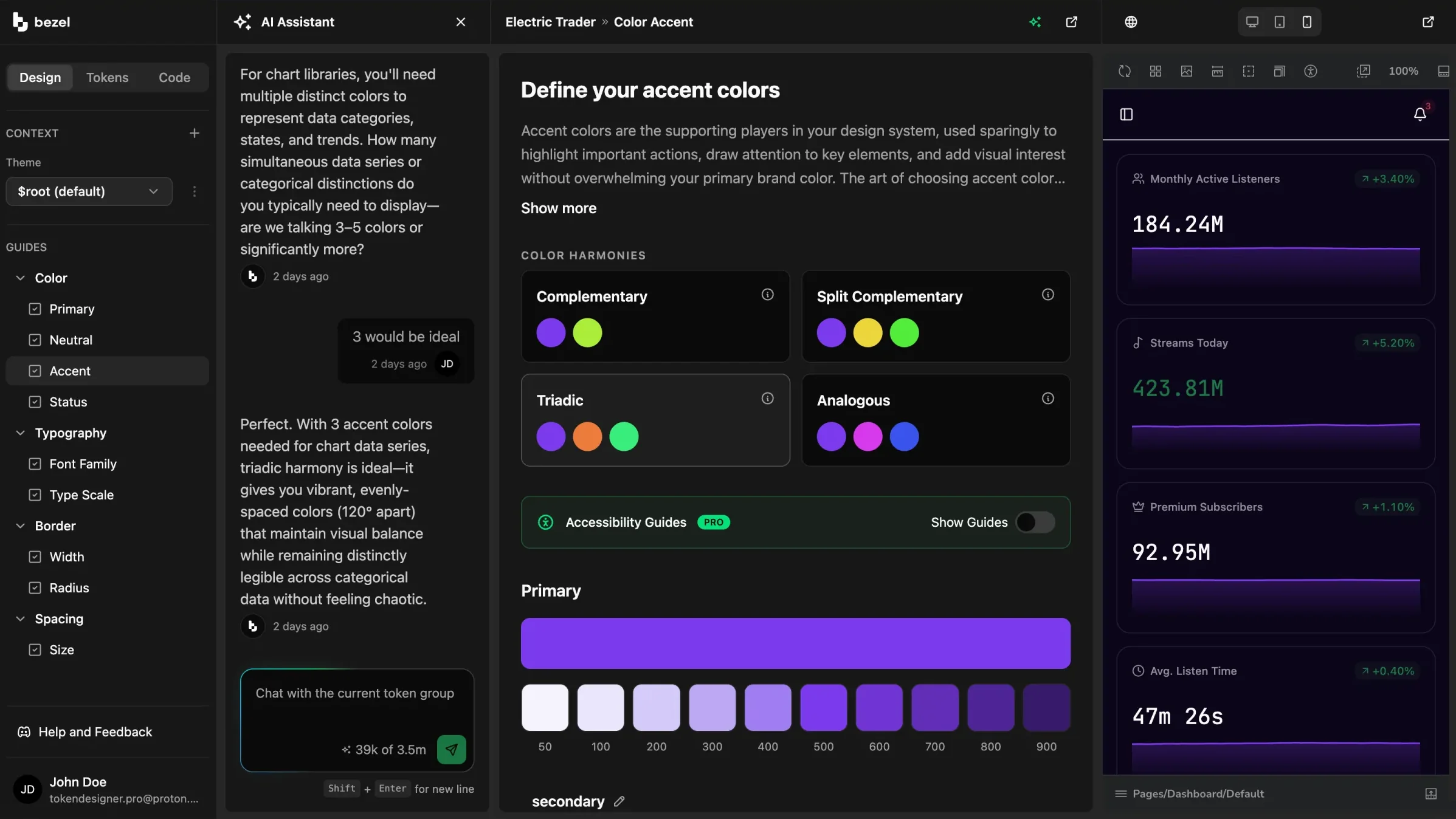
Live Previews
Change a token and watch buttons, links, inputs, cards, and application surfaces update immediately. Designers can judge the system in context instead of redrawing static mockups.
Point Bezel at your own component library or running app so the preview reflects the interface your customers will actually use.
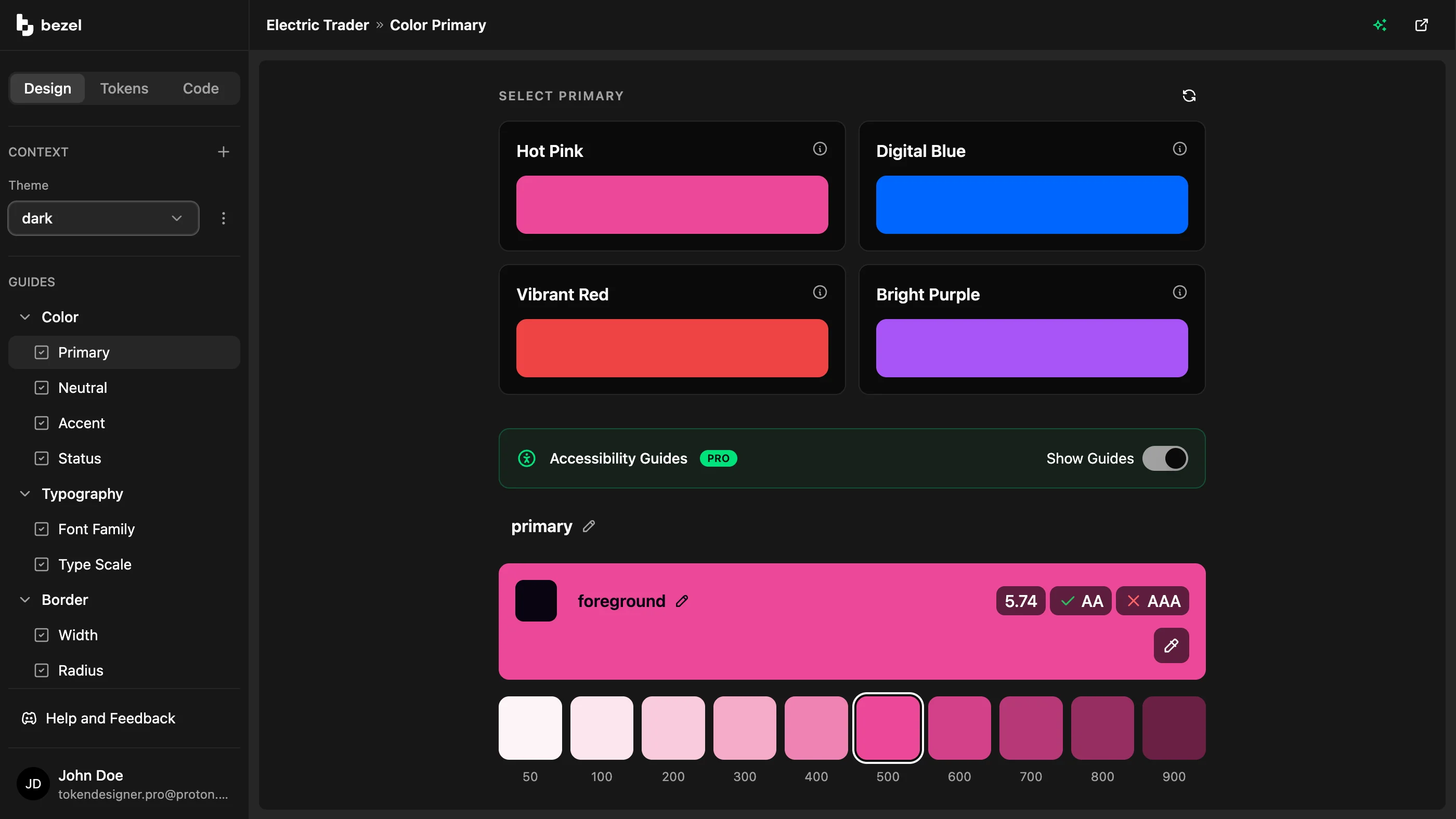
Built-In Accessibility
WCAG contrast ratios and AA and AAA results appear while you choose foreground and background colors, so inaccessible combinations are caught before they become product defaults.
Bezel can suggest accessible foreground pairings for generated palettes, making accessibility part of the design decision instead of a late-stage audit.
Turn a product brief into design tokens, visual guidelines, and accessible palettes your team can review.
Explore a warmer, calmer, more premium, or more technical direction and preview the impact before production changes.
Create color scales and foreground pairings with WCAG contrast feedback built into the workflow.
Bezel does not replace your design tools. It gives the decisions behind your product a structured home that developers, design engineers, and AI coding agents can read.
FAQ
Same System
Bezel gives design engineers a shared system for semantic tokens, component previews, exportable artifacts, and AI-readable guidelines, so design decisions keep their meaning from concept to production..
Bezel for Design EngineersAI can generate code quickly.
Bezel for DevelopersAI agents can write interface code quickly, but they need explicit design context to stay on brand.
Bezel for AI-Assisted TeamsEarly access · Space is limited!
Join Bezel as an early product partner and turn your first visual decisions into tokens, previews, and guidelines your team can build from. Join Pro at $7 per month for one year, billed annually, with personalized onboarding and support throughout your first year. As a product partner, your direct feedback will help guide new features and the future of Bezel.
Spots are extremely limited. Acceptance requires a demo and a commitment to sharing ongoing feedback.